color(s) of the week
- ccrystal212
- Jan 4
- 4 min read
Updated: Jan 4
COLOR(S) OF THE WEEK - CHANTILLY LACE + SUPER WHITE
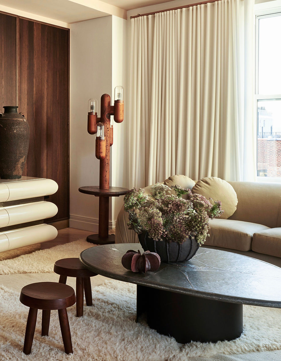
who doesn't love a crisp or warm white room?! white is the most used paint color for walls and ceilings, so it's important to select the right one. as mentioned in a previous lesson post, it's best to go with a white paint for a space when the space sees a decent amount of natural light. when used in the right space, white paint makes the room feel larger, brighter, and cleaner by reflecting light (hence why the room needs natural light to make this work). some spaces (depending on the amount of natural light) and aesthetics help determine just how intense you want the white paint color to be.
super white (OC-152), by benjamin moore, is one of my go-to's. as it's name states, it is super white. it's crisp, clean, and reads more of a true white. this color works best in a space that sees a good amount of natural light. it's a wonderful backdrop color when displaying art as it doesn't compete with any of the colors in the art piece. it's a great paint color when you want a strong color contrast. when we're designing a space that leans more modern, and again, if the room sees a lot of natural light, this is usually my pick! super white works well with both warm and cool color palettes. for example - it pairs perfectly well with a blue fabric as it does with an ochre fabric. same goes for metals - both brasses and chromes/nickels work well with it.
chantilly lace (OC-65), also by benjamin moore, is another go-to white paint color for CSD. it's a bit warmer and is part of benjamin moore's off-white collection. this color has warm undertones that gives the space a good subtle glow. it works great in a room that sees a lot of natural light and in a room that sees some but limited natural light. chantilly lace works well in a space that might not be as modern or contemporary aesthetic wise. it's a great color when working with a warmer palette for fabrics, woods, and brasses. that's not to say it doesn't work well with a polished nickel or chrome! it's just a feel good color and it's what my own living room is painted in!
when painting your room white, it's important to paint the ceiling in the same white as the walls UNLESS you're going for an accented or contrasting ceiling. too many times i see a room with warm white walls and a cool white paint color on the ceiling - it's a bad clash, a red choice - a term we use with our daughter when making a bad decision.
see how and why we used the colors below:


i highly recommend sampling your paint colors before applying them to the entire room. i order peel and stick samples from samplize. samples range $6.95 - $9.95 depending on the brand of paint and size of the sample. this may seem high, but it beats purchasing actual cans of paint and a paint brush. samples are usually delivered the following day. this business concept was such a brilliant idea - it's a life saver when you want to sample a lot of colors!!
now you know a little more when it comes to selecting a white paint for a room. hope you enjoyed this weeks color selects!
please don't forget to subscribe for more tips and color fun!!
wishing everyone a wonderful week ahead - back to the norm, yay!
cs


Comments