top of page
c r y s t a l s i n c l a i r d e s i g n s
posts


the sinclair questionnaire
EPISODE 5 - getting to know the brownstone boys say hello to jordan slocum and barry bordelon, also known as the brownstone boys! jordan and barry prefer to keep their projects close to home but dream of doing niche work in other historical cities. the pairs design aesthetic is rooted in honoring the history of a home while layering in modern functionality and personality. at the core of their work is the belief that old homes should evolve for the next 100 years, not lose th
May 281 min read


the sinclair questionnaire
EPISODE 4 - getting to know alison rose say hello to alison rose! alison is a residential interior designer and works all over, worldwide - new york, connecticut, miami, texas, chicago, and japan - just to name a few. she specializes in creating sophisticated environments that connects the physical space and the objects within that space with the inhabitants. alison has a gorgeous tile collection with artistic tile and a fabric colleciton with misia paris, of casamance. a spa
Apr 291 min read


the sinclair questionnaire
EPISODE 3 - getting to know michelle gerson say hello to michelle gerson! michelle is mainly a residential interior designer based in new york but designs spaces worldwide - new york, connecticut, palm beach, miami, boston, chicago, aspen, and london - just to name a few. her work is glamorous, unapologetically bold, yet approachable. she has an eye for luxury and sophistication. a space michelle recently completed now sit back, relax, and listen with your tequila espresso ma
Apr 211 min read


the sinclair questionnaire
EPISODE 2 - getting to know becky shea say hello to becky shea! becky is bi-coastal, splitting her time between los angeles and new york. she loves nature - she incorporates natural materials and plant life into her designs. she's drawn to organic modernism and the idea that how a space relates to the outdoors directly shapes how we experience and live within it. a recent project becky has completed in armonk, ny | photo by jake shea photo by jake shea sit back and relax wit
Apr 161 min read
the sinclair questionnaire
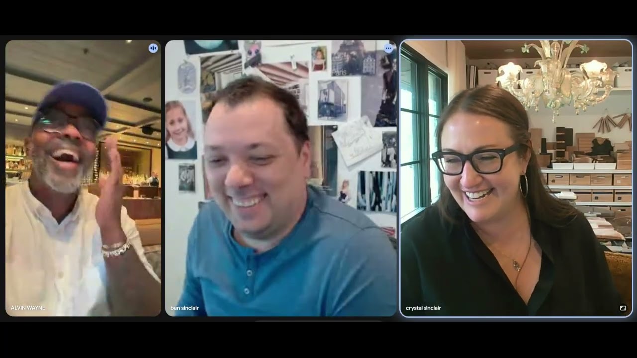
EPISODE 1 - getting to know alvin wayne we ask the important questions to the wonderful interior designer, alvin wayne. alvin is a fabulous designer located in new york city. he's truly a genuine person, a gem! his interior work is a mix of vintage and contemporary. he's not afraid of bold colors and knows how to work them perfectly into a space. a space he recently completed on east 9th street in NYC now, sit back and enjoy with a delicious cucumber gimlet!! please be sure
Apr 141 min read
bottom of page