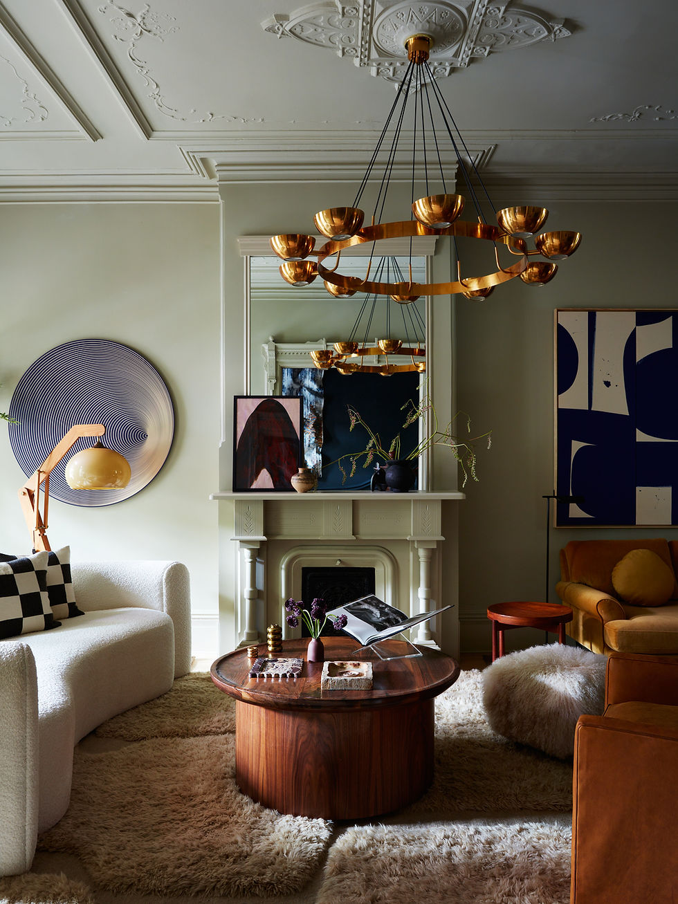
color of the week
- ccrystal212
- Dec 2, 2025
- 1 min read
COLOR OF THE WEEK - NIMBUS GRAY
who doesn't love a good blue?! one of our go-to blue paint colors is nimbus gray (do you prefer gray or grey? i'm team grey!) by benjamin moore. it's a soft, warm blue. it's saturated just enough to make the color POP without overpowering the room. this color works well in spaces that see lots of natural light or gets at least some partial natural light. it's soft enough for a nursery and bold enough for a dramatic kitchen. it's really a perfect blue! see how we worked with nimbus gray below.
here, we went with nimbus gray for the cabinetry, walls, and ceiling for a kitchen in harlem, new york. it's a perfect contrast to the rosso levanto marble (red marble). the color works well with the ornate details.

here, we went with nimbus gray for a color drenched nursery in hoboken, new jersey. again, the color working really well with the classic mouldings! this is a girls nursery but the color would work just as well for a boys room.

here, we went with nimbus gray for a shared kids lounge that's in a high-rise apartment in manhattan, new york. the color works well in a more modern space too!

hope you've enjoyed this color of the week! please subscribe for future color picks!
warmly -
cs


Comments