color of the week
- Dec 22, 2025
- 2 min read
COLOR OF THE WEEK - RAPHAEL
i love a good dark color (as many of you know)! darker tones usually create a more dramatic space. burgundy, a deep reddish-purple color, is no exception! it's so warm and inviting and kind of has a mysteriousness to it. it's a rich, deep color. burgundy is named after the fine wines from france's burgundy region. raphael (CC-2), by benjamin moore is just the perfect shade of burgundy!! it's warm without being too warm but still doesn't read too purple.
raphael pairs well with brass finishes and darker, warm wood tones adding to its own warmth. the color works well in a darker space (meaning it doesn't see a lot of sunlight). it's a strong color, so be careful when pairing with other vibrant colors, but when done well it could create a phenomenal space! i could see this color being paired with a soft blue perhaps or even a pink!!
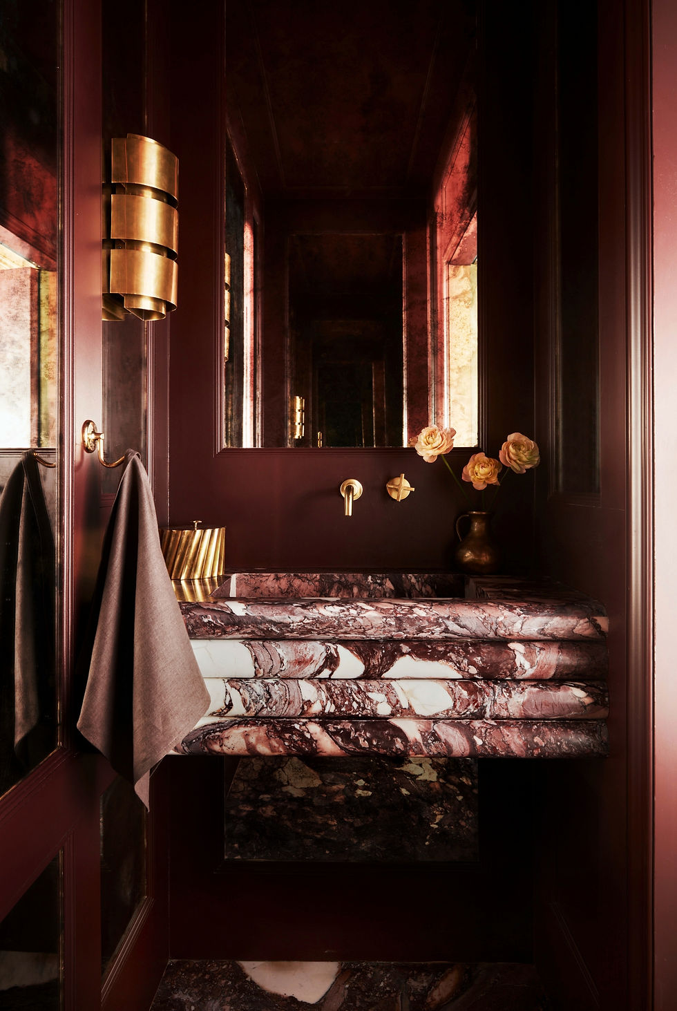
here we went with raphael for a color drenched powder bathroom! it's a moody space - provocative and sexy. the walls and ceiling are paneled and painted in the raphael color - a satin sheen. foxed (distressed) mirrors are installed between the panels. we paired the color with a custom fabricated breccia viola marble vanity and slab floor - ooo la la! brass fixtures finish off the space. it's one of my favorite jewel boxes we've designed!
here, the burgundy color was paired with white accents and ceiling. other colors in the room were kept neutral. the walls almost read a velvet texture!!

here, the color reads rich with the vintage gold gilded frames. the dark wood tones pair perfectly with the burgundy color. again, other colors were kept neutral.

here, a door was painted in raphael. a nice contrast to the cream color walls adding contrast and interest to the space!

hope you enjoyed this weeks dramatic color! please don't forget to subscribe for more tips and color fun!!
wishing everyone a warm holiday season!!
cs


Comments